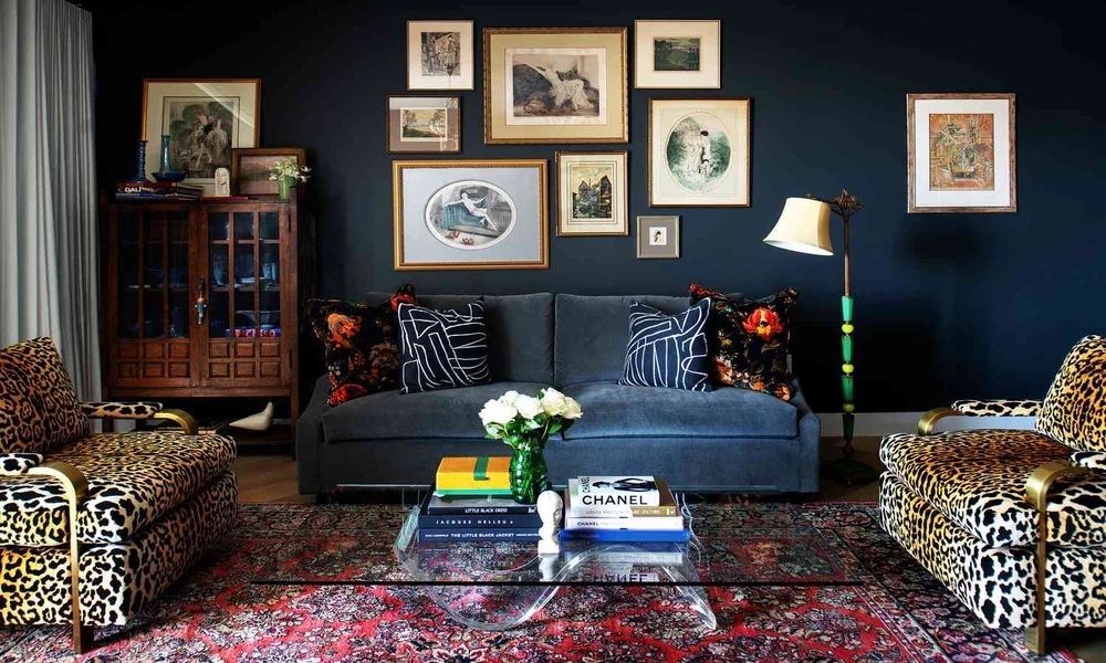
I spent three weekends last spring hunting for a credenza, and I walked away from four of them. The fifth one, a walnut piece with tapered legs and a faint water ring on top, came home with me for a sum that would cover two months of groceries. My neighbor told me it looked like something from her grandparent’s basement. Six months later, she asked where I found it.
That’s the whole trick with mid-century design. The pieces are gorgeous on their own and disastrous when you fill an entire room with them. Push a living room too far into 1962 and it stops looking intentional and starts looking like a theme restaurant. So here’s the promise: by the end, you’ll know exactly which pieces to buy first, which to avoid, and how to blend them into a home that still feels like it belongs to you.
Why mid-century still works in almost any room
Start with the shape of the thing. Mid-century furniture sits low, shows its legs, and keeps its silhouette clean. Those three traits happen to solve the biggest problem in most modern apartments, which is that everything feels too heavy. A sofa with four visible tapered legs takes up the same floor space as a bulky sectional, but your eye can travel under it, so the room breathes.
The other reason is history. This style didn’t appear from nowhere in 1954. Design historians trace it back further than most people realize, and people were experimenting with clean lines and industrial materials going back to the 19th century according to the Smithsonian Institution, which makes it one of the few American design movements with a genuinely documented origin story rather than a marketing one. That matters when you’re spending real money. You’re buying into a tradition, not a trend.
Wood tone is where I’d tell you to be picky. Warm walnut and teak play nicely with almost anything. Pale birch is harder to work with, and it can read as flimsy next to modern upholstery. I’d skip it unless you’re building a room around it.
Where do most people go wrong when they buy it?
They buy matching sets. This is the single most common mistake I see, and it kills rooms.
A full suite of identical mid-century furniture, sold together and arranged together, looks like a showroom floor from fifty years ago. Designers almost never worked that way. A buyer might have picked up one chair one year and a table three years later, and the resulting mix was the whole point. So buy pieces that share a language, not a catalog number.
Shared language means similar wood tones, similar leg angles, and a similar level of visual noise. A Danish teak buffet and a lacquered 1980s oak bookcase can absolutely live in the same room if the wood roughly agrees. What won’t work is pairing a delicate spindle-leg chair with a chunky reclaimed-wood coffee table. The styles fight, and your eye notices even if you can’t name what’s wrong.
There’s also a scale problem. The original pieces were designed for houses with lower ceilings and smaller rooms. If you’re working with a 1920s bungalow or a modern build with tall windows, a single low credenza can look lost against a bare wall. In that case you need height from somewhere else, and the easy answer is an architectural lamp or a tall plant, not a taller cabinet.
The three-zone rule I use in every room
Here’s the framework I’ve landed on after enough buying mistakes that I started keeping notes. I call it the three-zone rule, and it works in apartments, bungalows, and everything between.
Divide the room into three zones by age. One zone holds the actual mid-century pieces, usually two or three items, and that’s where your money goes. The second zone is contemporary, meaning anything you bought new in the last decade. The third zone is neutral, the stuff nobody thinks about, like a plain linen sofa, a simple jute rug, or a basic bookshelf.
The ratio I aim for is roughly 30 percent vintage, 30 percent modern, 40 percent neutral. Written out, it looks fussy. In practice it takes about ten minutes to check. Walk into your room, name what’s in each zone, and see which one is starving.
- Vintage zone: the credenza, a lounge chair, a coffee table, anything with real age and visible joinery.
- Modern zone: your sofa, your bed frame, your media setup, anything bought in the past five to ten years.
- Neutral zone: rugs, lamps, curtains, plants, the quiet stuff holding the room together.
When I moved into my current place, the modern zone was eating the room alive. Everything I owned was gray. Adding two vintage pieces fixed it faster than repainting would have, and repainting would have cost more.
Building your collection without overspending
Buy in this order. It saves you from the classic mistake of owning a gorgeous chair with nowhere to put it.
- One anchor piece. A credenza or a sofa. This sets your wood tone for everything else.
- One seating piece. A lounge chair, ideally in a color that isn’t the same as your sofa.
- One table. Coffee or side, doesn’t matter. Match the leg style to your anchor.
- Lighting. Last, always last. Lighting is where the room either comes together or falls apart.
On price, watch the middle of the market. The cheapest tier is usually furniture from the 1980s dressed up with the right keywords, and it won’t hold value or hold up. The top tier is auction house territory. The sweet spot sits in the middle, where you’re paying for real age and decent condition rather than a name. Industry wage data from the Bureau of Labor Statistics puts furniture retail work in a fairly modest pay band, which is a roundabout way of saying the markup on a piece isn’t going to a craftsman. It’s going to the dealer’s rent. Buy from sellers who can tell you where a piece came from.
One more thing. Check the joinery before you check the price tag. Dovetails on a drawer mean somebody built it to last. Staples mean somebody built it fast.
Blending wood tones without making a mess
You can mix woods. You just can’t mix them randomly. Pick one dominant tone and one accent tone, then stop.
My rule is that the accent should be noticeably lighter or noticeably darker, never slightly different. Slightly different reads as a mistake. Noticeably different reads as a decision. If you’re hunting for pieces and you can’t tell whether two woods match, they don’t, and you should walk away.
Metal is your escape hatch. Brass and black steel both sit comfortably between warm and cool wood tones, which is why so many mid-century lamps use them. If a room feels off and you can’t figure out why, adding one brass element often settles it. This is also where a reputable rental or shared workspace gets it right, since they mix periods constantly. The Association for Print Technologies is not a furniture source, so don’t go there for decor advice; my point is simply that organizations publishing durable reference material tend to favor contrast over matching, and interiors reward the same instinct.
Where to actually shop
Big-box stores sell reproductions, and some of them are fine. What they can’t give you is a piece with a story, and they mostly won’t give you solid wood either. Vintage shops and estate sales will. Online vintage marketplaces will too, and that’s where I’ve had the best luck.
The convenience of shopping a curated mid century modern furniture collection is that someone with an eye for period and condition has already filtered out the junk, so you spend your time choosing between good options instead of digging through listings. That’s worth something when you’re shopping on a lunch break. Check the return policy before you commit, and measure your doorway before you fall in love with anything.
Living in it, not curating it
Rooms that work aren’t rooms that look finished. They’re rooms that look used. My water-ring credenza holds board games, spare batteries, and a lamp that doesn’t match anything, and it’s the piece visitors ask about every time.
So start with one piece. Bring it home, live with it for a month, and let it tell you what the room needs next. What’s the one corner of your place that’s been bugging you, and what would it take to fix it with a single purchase this weekend?
